Module 1: Basics of Data and Information
Problem: Use elevation sample points to create and show elevation information for an area using interpolation and hill shading.
Analysis Procedures: Geographic data links information about a location and its features (i.e. attributes), possibly with a time component. This data, and any representation of the earth created from it, will be partial and imperfect due to the complexity of the earth. Autocorrelation describes the degree to which near and distant objects are related. The sampling scheme chosen for a study can greatly impact the resulting spatial interpolation. For example, in an area that changes from low to high elevation, if all of the randomly sampled points happen to fall in areas of low elevation, the resulting interpolation (Fig. 1) will incorrectly depict the area as uniformly low in elevation. However, if the same area is sampled with stratified random sampling, one would be much more likely to capture areas of low and high elevation resulting in a more accurate interpolation of the area.
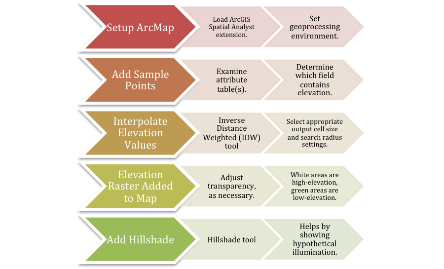
Figure 1. General workflow diagram for creating interpolated elevation and hillshade rasters in ArcMap. Click on diagram for enlarged image.
Representations can be discrete with well-defined boundaries or fields with continuous surfaces. This may done with raster or vector data (Fig. 2).
Results:
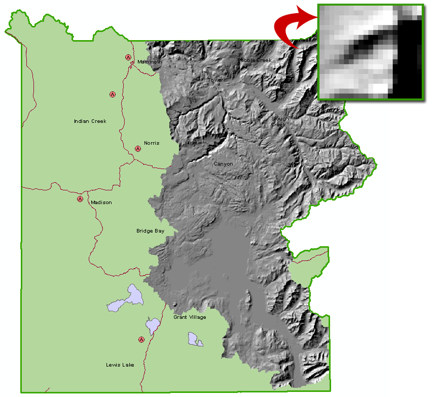
Figure 2. Yellowstone National Park representation created in module exercise. The western portion of the map depicts a discrete representation (i.e. polygon, lines, points), while the eastern portion depicts the continuous elevation surface via raster data. The inset shows some of the individual pixels of the raster data. Accuracy and uncertainty are dependent on the size of these pixels.
Application and Reflection: These interpolation results can be used to answer questions through spatial analysis. Simple queries, measurements, transformations, descriptive summaries, optimizations, and hypothesis testing are all possible using spatial analysis.
Module 2: Cartography, Map Production, and Geovisualization
Problem: Use line simplification to improve the visualization of GIS information at varying scales.
Analysis Procedures: Geographic information system (GIS) maps have a main advantage over paper maps in that they are interactive. GIS maps can have variable scale, variable extent, animation, 3D, supplements, and are endlessly customizable. In contrast, paper maps are fixed once printed. Customization of GIS maps allows the user to vary representations of attributes by color, line thickness, pattern, marker type, and size. These representations can change based on the scale of the map viewed, thereby keeping maps uncluttered. An example of this in practice is coastline information. Coastlines are incredibly detailed. This detail is useful on a large scale map, but unnecessary when in small scale. ArcMap can simplify line details, so that the user can display data appropriate to the map’s scale (Figs. 3 and 4).
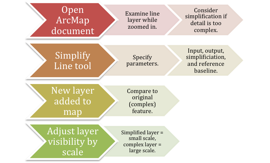
Figure 3. Generalized workflow diagram for simplifying a line feature in ArcMap.
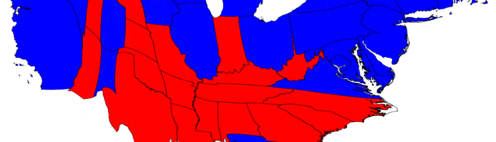
The spatial properties of GIS maps can also be distorted in proportion to attribute values. The image at the heading of this summary depicts the results of the 2012 election where the sizes of the states are scaled proportionally to their number of electoral votes. Additional cartograms of the 2012 US presidential election can be found here.
Visualization in scientific computing (ViSC) refers to new technologies and environments for displaying and working with data. The end goal is to help the user interpret, validate, and explore the data. An example of this is the growth of publicly available GIS applications that allow the general consumer to perform simple information searches, get data updated in real-time, and experience 3D visualizations. More advanced methods of visualization include dasymetric and multivariate mapping.
Results:
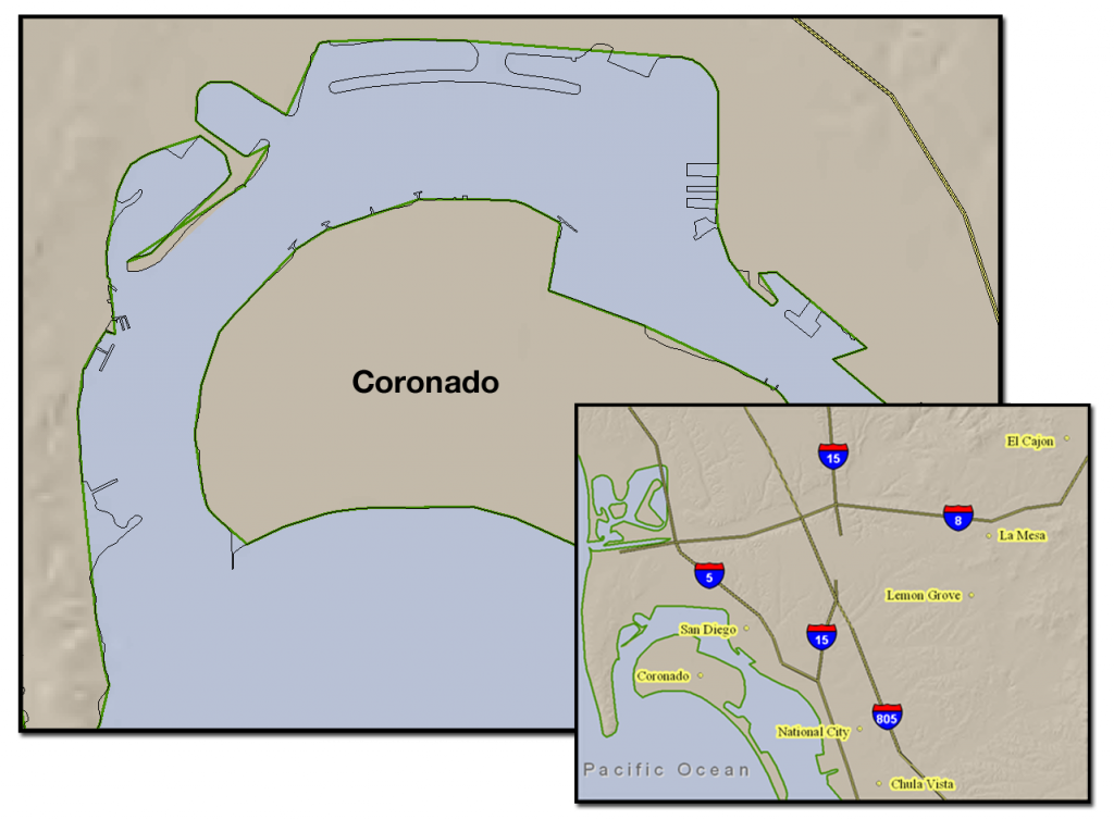
Figure 4. The San Diego coastline near Coronado. The large scale map shows the original, detailed coastline data in black. The thicker, green line represents the new, simplified coastline. This simplified coastline causes data to be lost in the large scale map, however its simplicity makes for a clearer small scale map (inset).
Application and Reflection: Dasymetric mapping reestablishes accuracy to a dataset by making inferences from another dataset. For example, if a biologist wants to map the population density of North American black bears (Ursus americanus) it would be reasonable to infer from a second dataset of lake locations that no bears will be found within lakes. Multivariate mapping provides a representation of two or more attributes in the same map. This type of mapping makes it easier for users to visualize relationships among the data. An example would be a map relating biodiversity level and habitat type.
Module 3: Query and Measurement
Problem: Utilize multiple queries to perform a simple site selection.
Analysis Procedures: Data can be visualized in a variety of GIS view including catalogs, maps, tables, histograms, and scatterplots. The catalog view is especially important for examining metadata, the technical information for individual GIS files. Advanced queries can be made which link tables or plots to maps. This can allow the user to visualize relationships that may have otherwise not be noticed. Finally, GIS allows measurement queries to be made that can be simple distances between points or more complex, such as compactness (i.e. comparison of a shape’s perimeter to area, where circles = 1), slope, and aspect (i.e. compass direction). Elevation data is necessary to derive both slope and aspect and is dependent on the resolution of the elevation data. These query techniques allow users to easily find areas of interest based on location and attributes (Figs. 5 and 6).
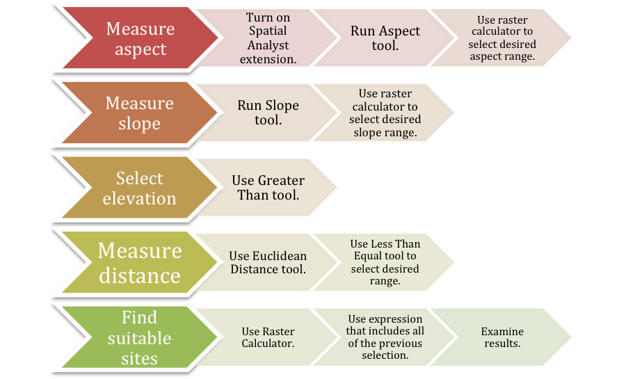
Figure 5. Example generalized workflow diagram for site selection using multiple queries and measurement in ArcMap. Click on diagram for enlarged image.
Results:
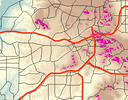
Figure 6. Potential vineyard sites (fuchsia areas) selected by measuring parameters and choosing only those desirable for grape growing.
Application and Reflection: Query and measurement is the basis of the power of GIS. These tools can be used to obtain simple data, such as the distance between two points or they can be used for complicated spatial analyses, such as those used in site suitability analysis with raster data. For example, geographic and land use data may be collected and analyzed to determine where certain wildlife species are likely to be found or locations that might benefit from additional protection.
Module 4: Transformations and Descriptive Summaries
Problem: Use multiple methods and tools to obtain new information that summarizes collected data.
Analysis Procedures: GIS allows the user to combine and analyze existing data, thereby creating new data. Buffers can be created around points, lines, or polygons of interest. Point-in-polygon analysis can then be used to determine what points fall within the buffer polygon. Polygon overlay compares two polygons and, similar to a Venn diagram, shows the area(s) of overlap.
Spatial interpolation is used to derive previously unknown values based on estimates made from known samples. Two common ways this is done is through inverse distance weighting (IDW) and Kriging. IDW simply takes an average that is weighted by distance. Kriging also uses a weighted average affected by distance, but also accounts for whether the sample points are clustered or more evenly distributed. Density, which does not predict a value for a specific location, but gives a ratio of amount to area, can also be useful. Density can be calculated via a search radius or using a kernel function.

Figure 9. The Varignon Frame Experiment. The spatial location on the table is affected by the location of the points and the amount of weight attached. Image from Cervone et al. 2012.
Spatial data can also be summarized descriptively, similarly to statistical summaries (Figs. 7 and 8). Centers and dispersion are similar to averages and standard deviation, respectively. Centers can be calculated using a centroid or minimum aggregate travel (MAT). The Varignon Frame Experiment is a visual representation of MAT (Fig. 9) where the location is determined by the weight at each sample point. A simple measure of dispersion is the mean distance from the centroid. Finally, spatial dependence (i.e. autocorrelation) and fragmentation can also help to describe spatial data.
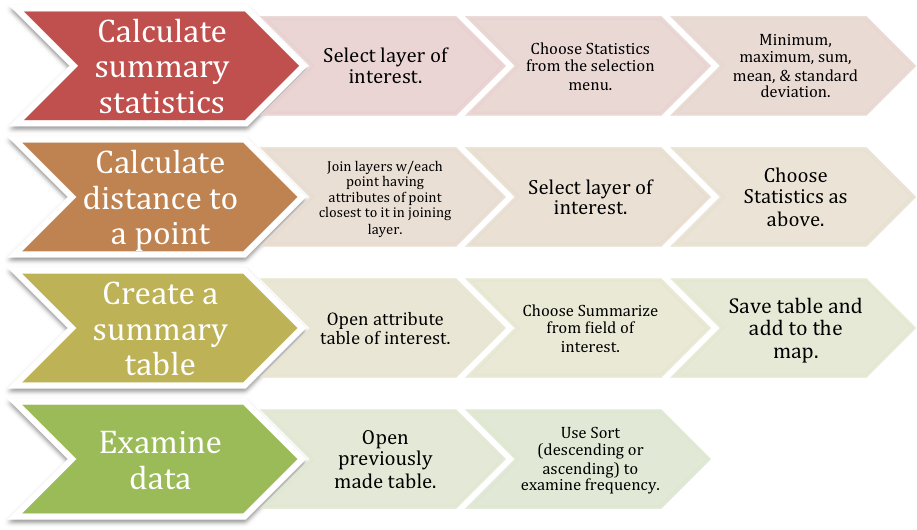
Figure 7. Generalized workflow diagram for calculating some measures of central tendency and dispersion in ArcMap. Click on diagram for enlarged image.
Results:
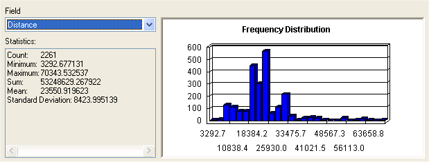
Figure 8. Example statistical results from calculating the distance (m) each customer travels to a store.
Application and Reflection: Measuring central tendencies, dispersion, and creating new data, such as drawing buffers is an integral part of many GIS studies. These are important for summarizing data, looking for possible trends, and as the foundation of more complex analyses. Spatial interpolation is important in wildlife and conservation research, where data is likely measured at several points, but large areas exist between the points. Weather stations may measure temperature within deer habitat. In order to estimate the temperature at the specific location recorded from an individuals GPS collar, the temperature data must be spatially interpolated across the entire area. GIS provides multiple tools for summarizing and deriving new information from data.
Module 5: Optimization and Hypothesis Testing
Problem: Solve an optimization problem by finding a least cost path, given selection requirements.
Analysis Procedures: Optimization problems in GIS involve finding the best locations, routes, and paths. Paths are different from routes in that they are on unrestricted surfaces, for example, a national park or wildlife refuge vs. city streets. Location-allocation problems deal with minimizing distances either minimizing a distance to all other locations (location) or minimizing a distance to a set of reference points (allocation). Coverage problems involve minimizing a factor other than total distance, such as greatest distance. Additionally, optimization problems can be “salesman” problems where all locations must be visited in the most efficient manner or “orienteering” problems where the locations visited must be maximized with regard to some limitation, such as cost or time (Figs. 10 and 11). Due to the possible complexity of all of these problems, they may be solved heuristically meaning that a very good solution that is found quickly is better than the best solution found eventually.
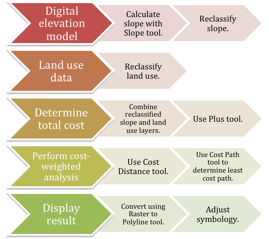
Figure 10. Generalized workflow diagram for calculating a least cost path, given slope and land use as cost factors.
Hypothesis testing and inferential statistics can be used with caution with spatial data and are often limited. Geographic data is often known for an entire area, making it possible to use descriptive statistics instead. When using inferential statistics, one must make sure that the spatial data can fulfill the basic assumptions of random sampling and independence, which is often not possible. Finally, random samples give no information about the spatial arrangement of values, which is essential to GIS.
Results:
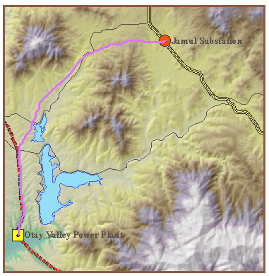
Figure 11. Results of calculating a least cost path (fuchsia line), given slope and land use as cost factors, for a power line.
Application and Reflection: Location problems involving optimization are common in wildlife management. These tools are useful for determining where to place roads to minimize impact, survey lines to minimize climbing, etc. Hypothesis testing procedures are often the basis of scientific inquiry and important in wildlife research, where it is unlikely that an entire population is surveyed. If a new type of management practice is being tested, hypothesis testing can determine with some level of confidence whether the new practice is different from the control (e.g. old method or no management).
Module 6: Uncertainty
Problem: Make use of a confusion matrix to determine uncertainty and errors in classification.
Analysis Procedures: Uncertainty is an unavoidable part of GIS data at all levels: conception, representation, measurement, and analysis. Fortunately, error tends to be evenly distributed throughout the data and when not biased, tends to cancel itself out. In order to identify error, some check of the data must be performed, such as ground-truthing aerial data.
Confusion matrices are used to determine errors in classification (Figs. 12 and 13). The matrix is set up similarly to how an epidemiologist would calculate sensitivity and specificity. The database values/classifications are listed in rows, while the gold standard (e.g. ground-truthed observations) are listed in columns. This allows the user to calculate the percentage of correctly classified values (PCC) and a Kappa index, which corrects for chance. The Kappa index is always lower than the PCC value because it is adjusted for the classifications that were correct purely by chance.
Interval and ratio data are more likely to have measurement error than classification error. The error is dependent on the accuracy and precision of the measurements. Accuracy is a measurement of how close the values are to the true value, while precision refers to how close the values are to each other. The root mean square error (RMSE), which is identical to a standard deviation, can give a measurement of the total error.
The user must remember that errors are often autocorrelated (e.g. collected by the same observer, using the same control points) and will be propagated throughout an analysis. These propagated errors can be shown quantitatively or by creating realizations, essentially presenting both the best and worst case scenarios.
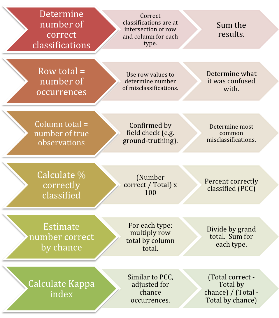
Figure 12. Generalized workflow diagram for working through a confusion matrix.
Results:
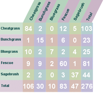
Figure 13. Example confusion matrix demonstrating classification of grass types. A total of 203 records were correctly classified. Fescue was most often classified as cheatgrass. PCC = 73.6%. The total number of correct classifications attributed to chance was 75 and the Kappa index was 63.7%
Application and Reflection: These concepts are vital for all fields and applications of GIS and can be as easy as making sure to use data that has metadata and only using the appropriate number of significant digits or as complicated as using RMSE and fuzzy set theory. By understanding what you do not know about your data, investigating alternate outcomes, using multiple data sources, and documenting errors, the user can mitigate the effects of uncertainty on spatial data.